
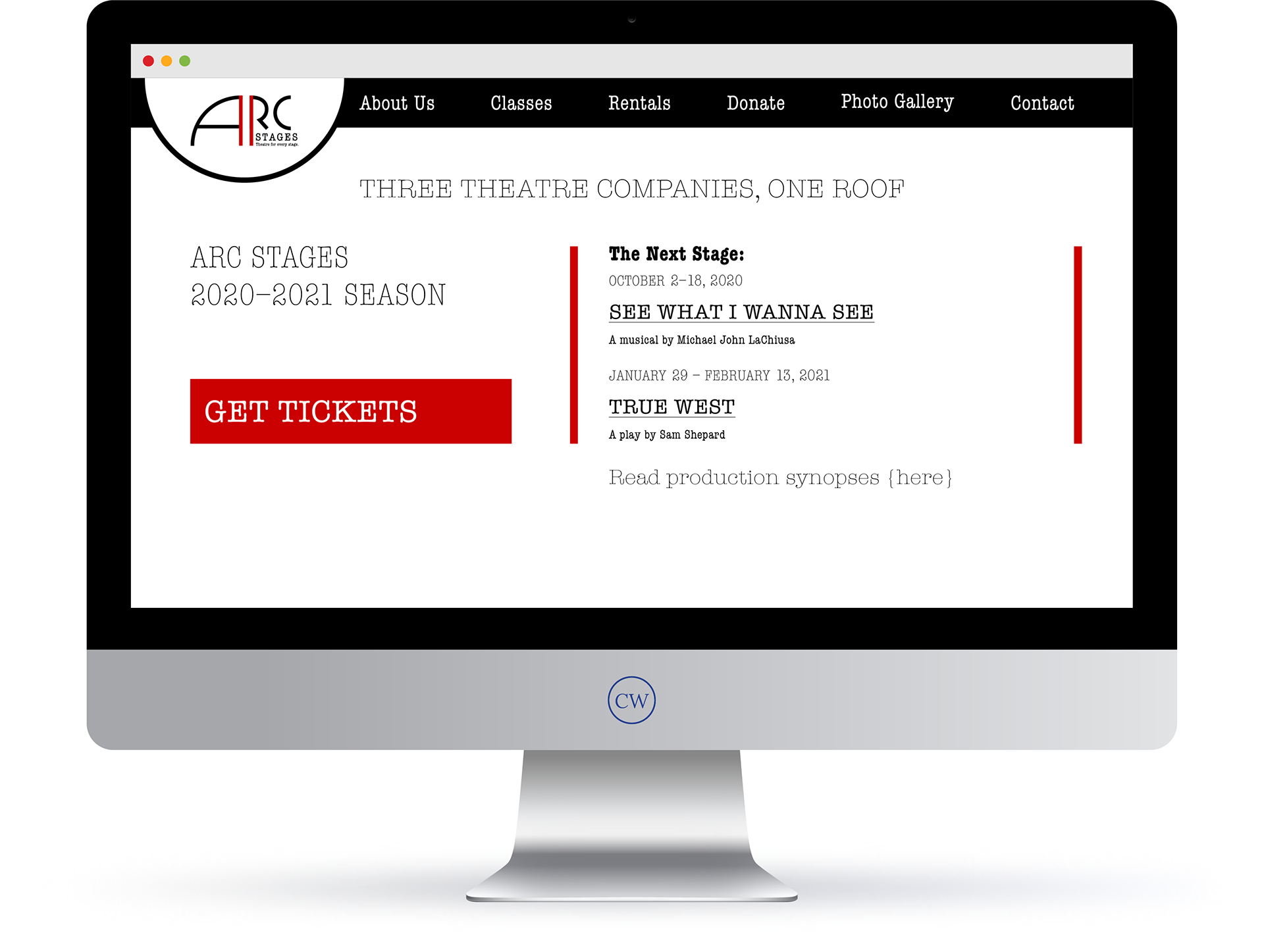
A redesign and rebrand of my local theatre organization. Taking my cue from the name, the redesigned logo is based on an arc of a perfect circle. I paired the logo with the American Typewriter typeface (Monotype) in reference to the typography used for original playwright manuscripts. The animated logo is meant to evoke the beginning of a stage production; the orchestra tunes up and the curtains part. I also designed three web pages to detail a smoother transition for purchasing tickets.
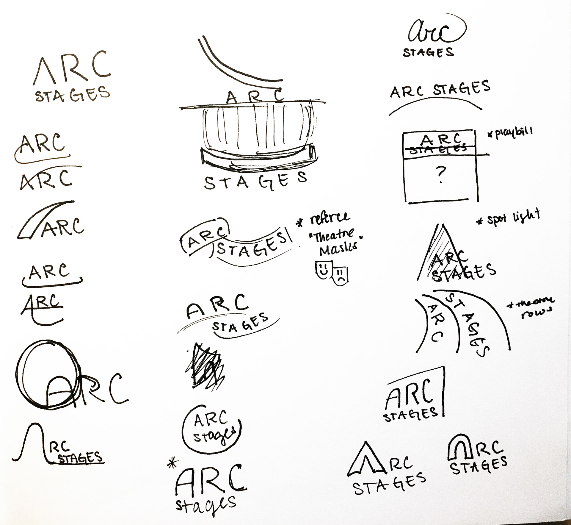
Preliminary logo sketches